

Beaumont Mill
A historic textile mill, reborn as a place to live.
Beaumont Mill is the adaptive reuse of one of Spartanburg's most storied textile properties, the original home of the Beaumont Manufacturing Company. From the early 1900s forward, it powered a self-contained mill village with its own streets, reservoir, and creek, employed thousands across generations, and earned the Army-Navy "E" Award four times for production excellence during World War II. Few buildings in the Upstate carry this much character on the deed.
This identity treats that history as raw material, not nostalgia. The goal is a logo system that feels rooted in the mill's legacy while reading as a modern place to live. What follows are three distinct directions, each grounded in a different angle of the Beaumont story, with rationale, supporting marks, and a tonal point of view for each.
Direction & Tone
Three logo directions with strategic rationale, initial wordmarks and supporting marks, and a tonal point of view on color and typography per direction.
System & Application
Refined logo system and sub-marks, full color and typography, brand guidelines, and application design across signage, leasing, web, and environmental.
Rooted in history. Woven into the community.
You know the building better than we do. Beaumont Mill carries a century of weight, and a century of weave. We won't walk you through what's already in the deed.
The Army-Navy "E" Award. The mill village map. The masthead. The Beaumont Duck. The directions that follow are rooted in real artifacts, real moments, real details. Nothing invented from whole cloth.
The reservoir. The creek. The streets named for families and foremen. The newsletter that bound the village together. The directions that follow are woven into the place the mill built.
We're not inventing a brand.
We're translating one.
Three angles. One mill.
Each direction is its own chapter. Read in order, or jump to the one that pulls you in.
The Mill
The architecture is the brand. The building does the talking.
Jump to concept 02 / DirectionThe Thread
Heritage made literal. The cone carries the brand.
Jump to concept 03 / DirectionThe Masthead
Typography lifted from the archive. Words doing all the work.
Jump to conceptOne of these is Beaumont Mill.
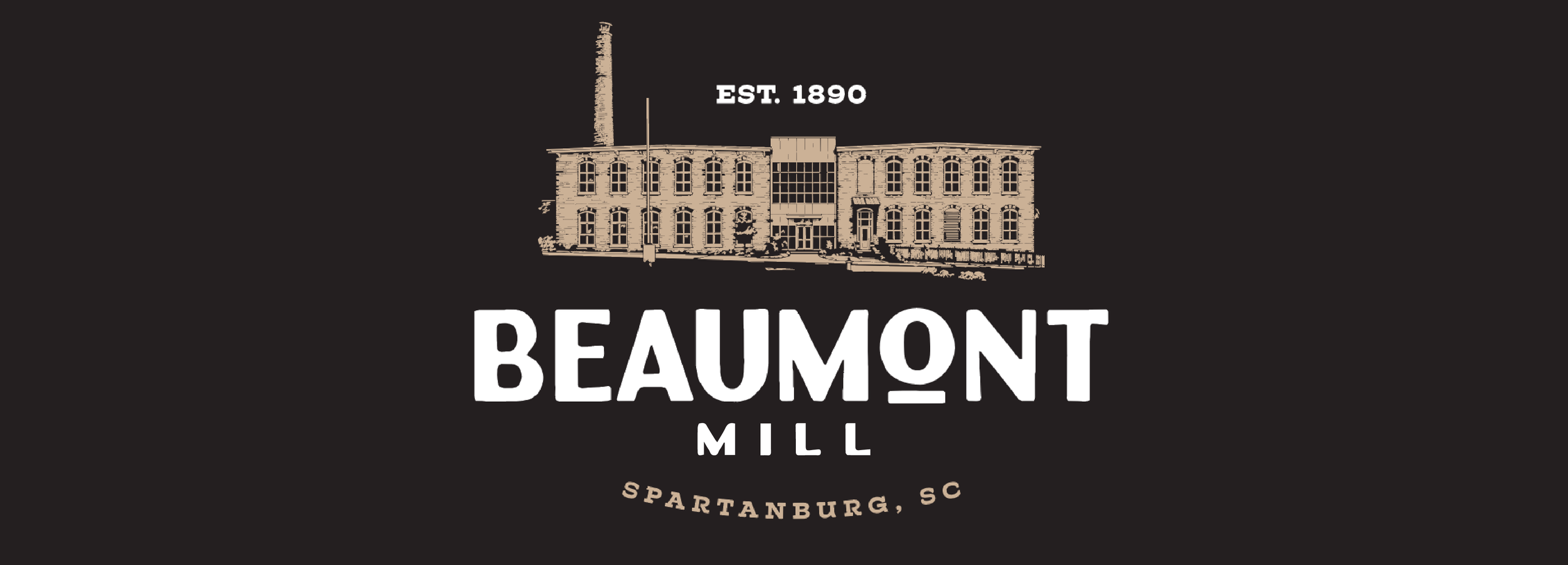
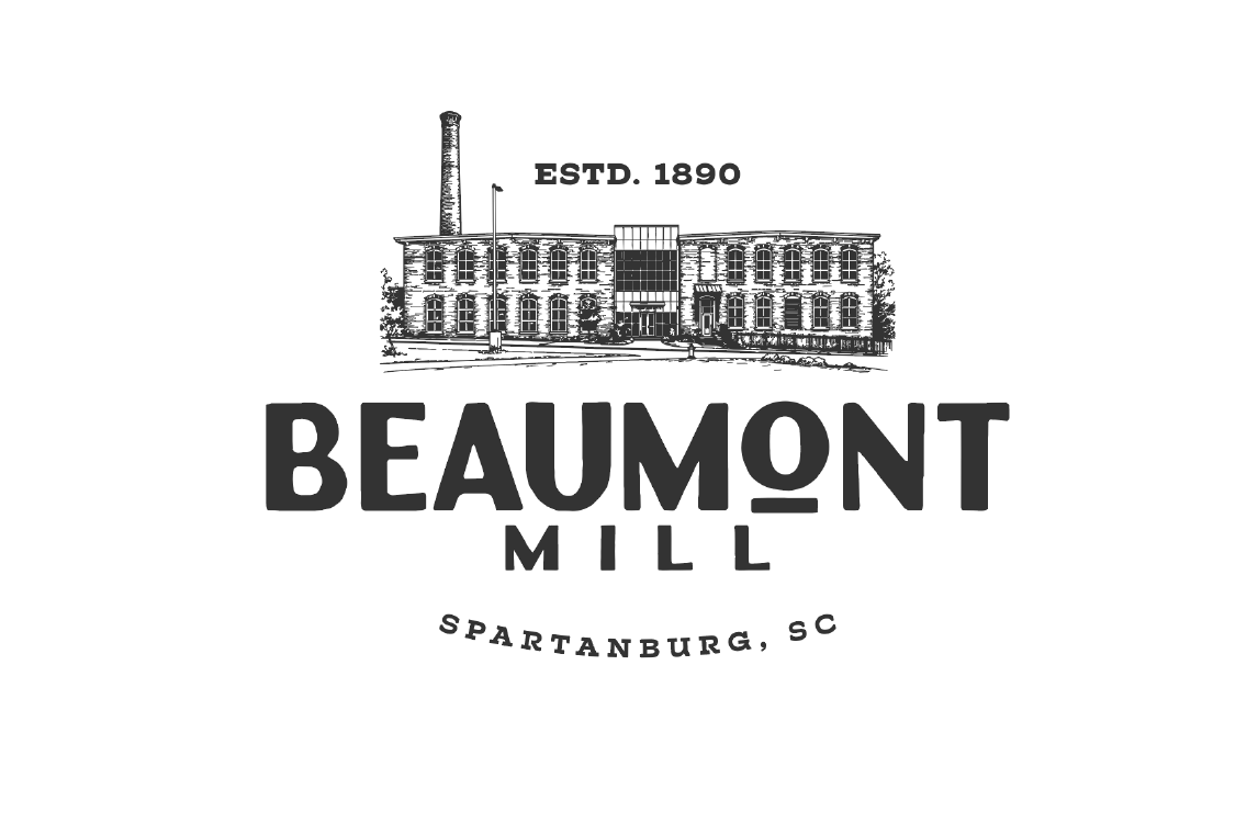
The Mill the address is the brand.
The building is the brand. When you tell someone you live at Beaumont Mill, you don't need to explain. The architecture is the proof, the smokestack is the landmark, and the silhouette is unmistakable from a block away. This direction takes the most direct route possible: depict the actual building, treat the architectural illustration as the hero asset, and let the wordmark hold the supporting frame. The system makes room for personality where it's needed (see: the Beaumont Duck), but the building does the heavy lifting.
This is the most place-grounded of the three directions. It reads as a destination brand rather than a product brand, which is the right move for an apartment community where the address itself is the proposition. The illustration keeps the mark human and editorial. The chunky modern wordmark keeps it from sliding into pure heritage territory. Best fit if Beaumont Mill should feel like an address residents arrive at, not an aesthetic they buy into.
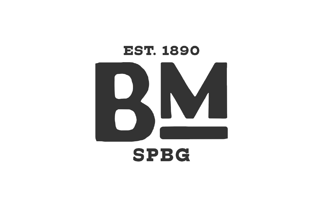 Monogram · Alternate Mark
 On Light Surface
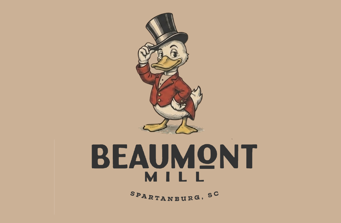 The Beaumont Duck
The duck isn't just decoration. During WWII, Beaumont's production shifted to cotton duck, the heavy woven fabric used for tents, tarps, sails, and military gear. That work earned the mill four Army-Navy "E" Awards. The duck lives on as an optional sub-mark for moments that need a little more personality.
Custom drawn
Modern condensed display sans, custom drawn with a distinctive lowercase O. Reads architectural rather than nostalgic. Anchors the wordmark with quiet authority.
Roboto Slab
Slab serif for "ESTD. 1890" and location stamps. Echoes the typewriter and industrial signage feel of the era without leaning fully retro.
Fraunces
Editorial serif for body copy, leasing collateral, and web. Carries warmth and history without losing modern legibility at any size.
 Apparel
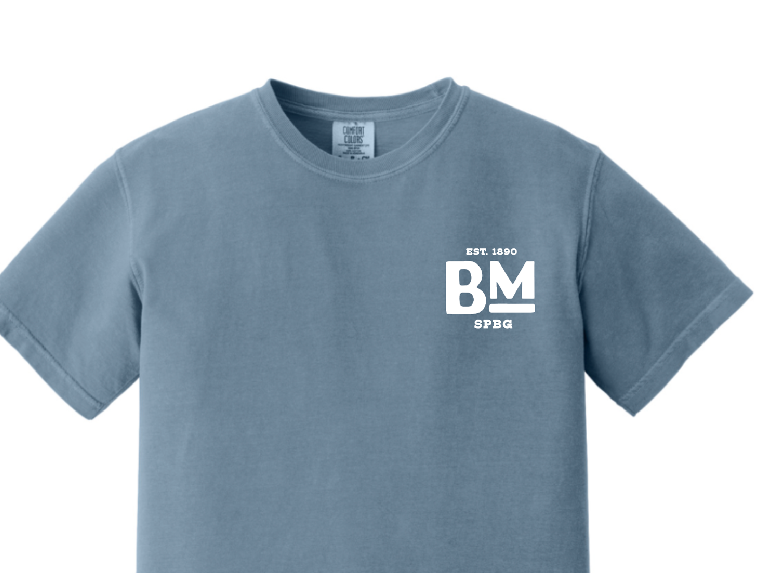 Apparel · Initials Mark
 Brand Color Application
The Thread heritage made literal.
The yarn cone is the most ownable asset in the entire mill story. It's the textile heritage made literal, the thread that bound the village together, and the one element no other Spartanburg property can claim. We led with it because it solves a hard problem: how do you make a residential brand for a textile mill feel rooted without feeling like a museum exhibit? The cone gives us a distinctive sub-mark that scales from a hangtag to a building wrap, and lets the wordmark stay clean.
The cone isn't just a logo. It's a kit. It functions as a hero illustration, a pattern repeat, a badge centerpiece, a wayfinding mark, a hangtag motif. Wherever Beaumont Mill needs a moment of personality, the cone does the work. The wordmark stays declarative. The cone stays expressive. Together, they cover the full range of brand applications without ever feeling thin.
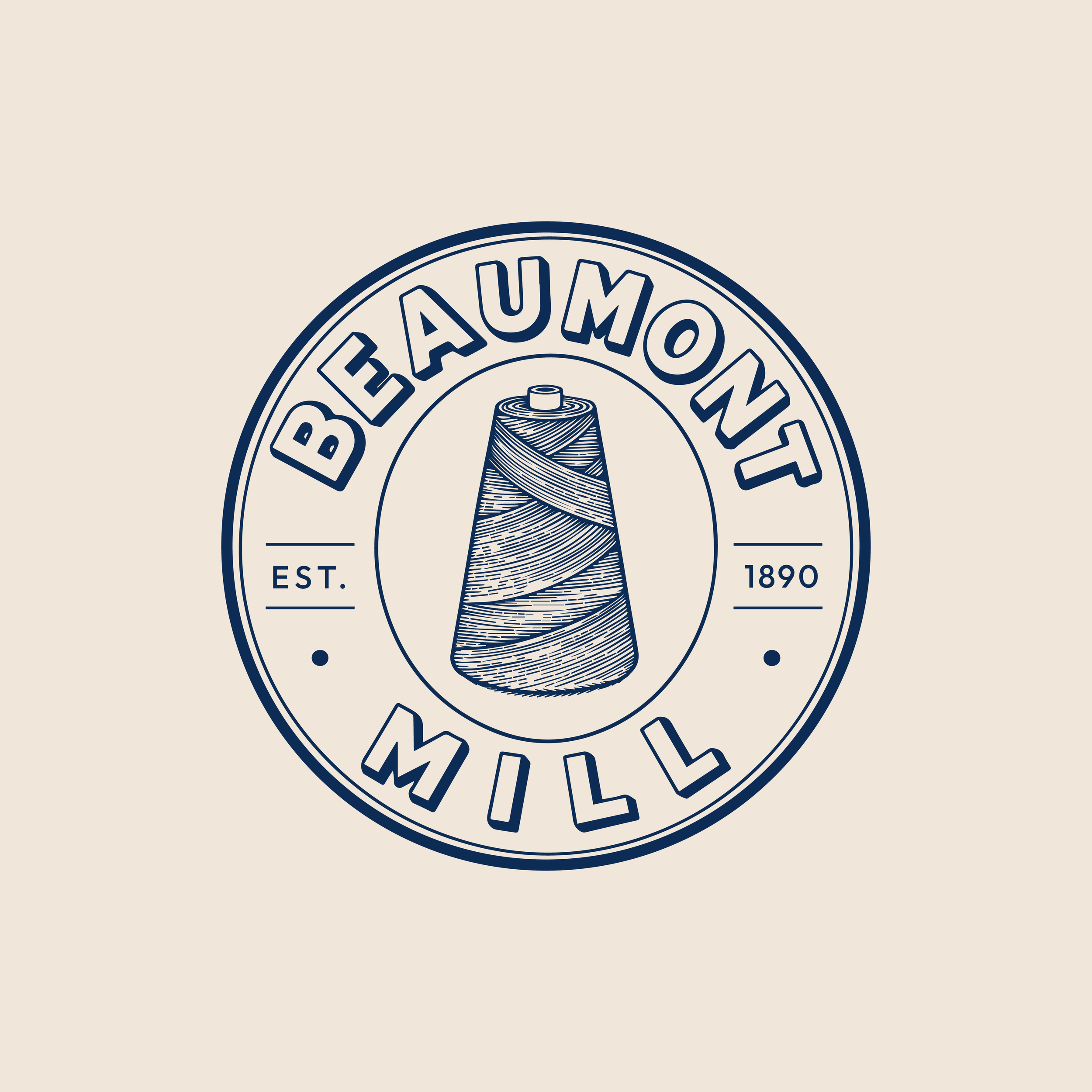
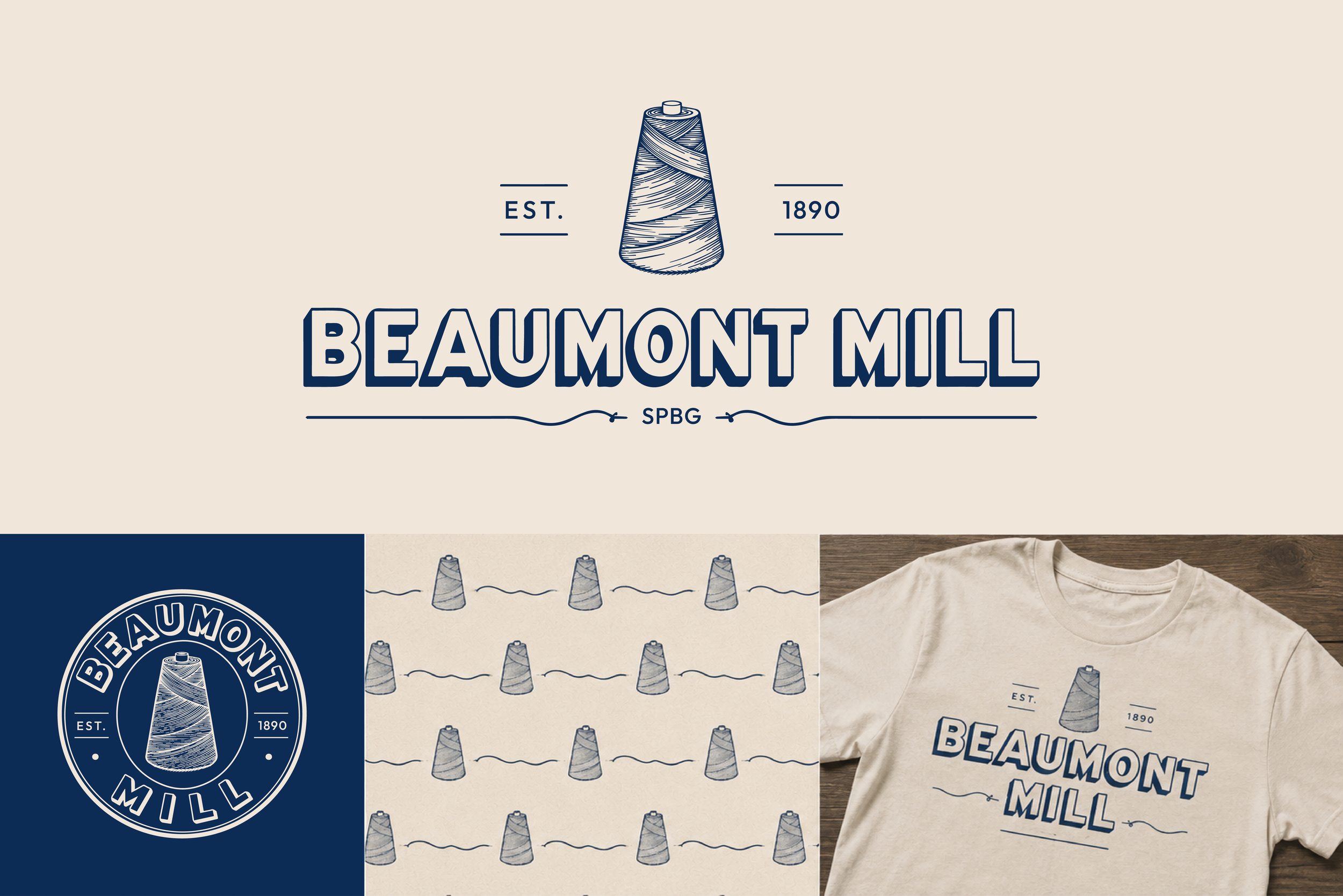
Custom drawn
Hand-drawn, dimensional, vintage industrial. Specific to Beaumont Mill. No off-the-shelf font replicates the dimensional shadow and the slight irregularity of the strokes.
Bebas Neue
For supporting headlines, signage callouts, and label work. Clean industrial bone that holds up at small sizes and large scale alike.
Fraunces
Editorial serif for body copy, leasing collateral, and web. Carries warmth and history without losing modern legibility at any size.
The Masthead lifted from the archive.
The wordmark is the entire brand. No illustration, no mascot, no architectural silhouette. Just typography, lifted directly from the masthead of "The Beaumont E," the newsletter that bound the village together for nearly two decades. This direction commits hardest to the source material. The script "The," the dimensional letters, the underline rule beneath: every element pulls from the original publication and reinterprets it at modern fidelity.
This is the most editorial of the three directions, and the most flexible at small sizes. No illustration to lose detail when scaled down. Reads instantly as a name, a place, an address. There's also a strategic bonus only this direction can claim: if it wins, the original "Beaumont E" newsletter has a direct revival path as a resident publication, with a brand voice already proven in the archive.
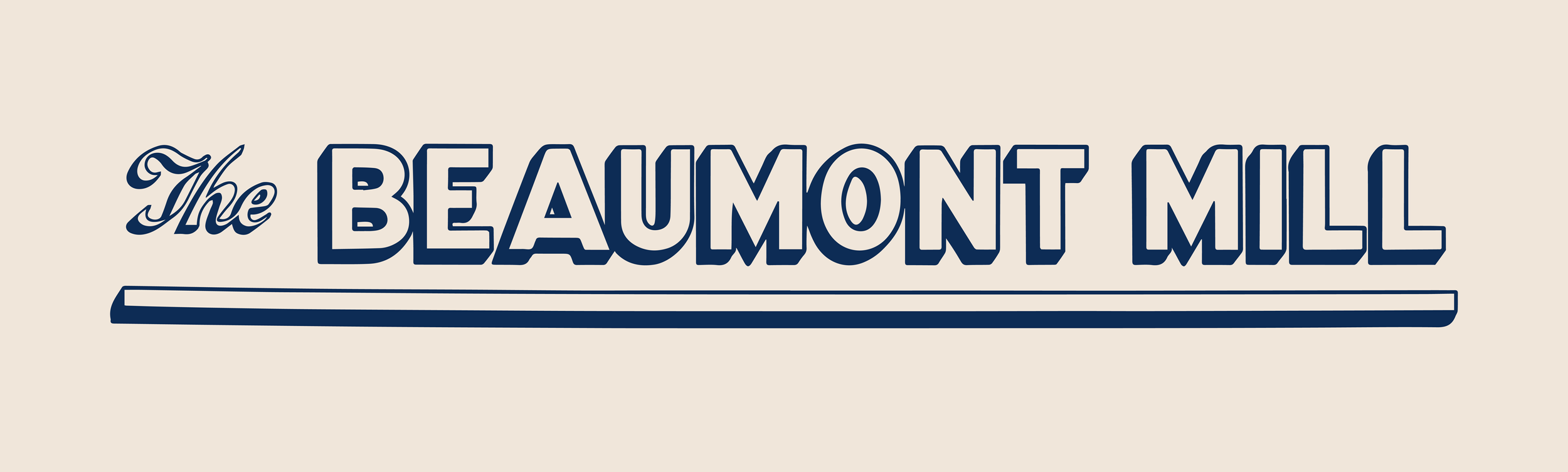
Custom drawn
Hand-drawn, dimensional, vintage industrial. The same family used in The Thread direction. Anchors the masthead with full editorial weight.
The
Custom drawn script for the "The," echoing the original Beaumont E masthead. Pinyon Script or a similar copperplate pairs as a fallback for digital extensions.
Fraunces
Editorial serif for body copy, leasing collateral, and publication work. Carries the editorial DNA of this direction into long-form text.
From here. the system takes shape.
Lock the Mark
Finalize the chosen direction. Refine the wordmark and sub-marks, lock final color values, and resolve any open questions on type.
Build the Kit
Full color and typography, sub-marks, patterns, and a brand guidelines document that lives with the building.
In the Wild
Beaumont Mill applied across signage, leasing collateral, web, environmental, and resident merch.
Take your time. When you're ready, pick one. We'll build the system from there.