
COMING TO GREENVILLE, NC
BRIGHTLEAF TOWNES
Inspired by the rich agricultural legacy of the region and the urban sophistication of Dickinson Avenue, Brightleaf Townes is a new residential landmark. Featuring 72 luxury brownstone-style apartments, this development seamlessly weaves historic character with modern connectivity.
ROUND 1: STYLE IDENTIFICATION & CONCEPT EXPLORATION
IDENTIFYING THE VISUAL ANCHORS
In this initial discovery phase, our objective is to explore the diverse historical and architectural narratives of Brightleaf Townes. We have developed several rough "territories"—ranging from modern minimalist marks to archival heritage seals—to gauge initial reactions and identify which style directions resonate most with the team.
These concepts are intentionally unrefined. They serve as a visual starting point to help us narrow the focus before we transition into formal brand refinement, typography weight studies, and final icon geometry.
DIRECTION 01
HANDCRAFTED PERMANENCE
Brightleaf’s visual world is built on the concept of longevity. Everything should feel etched, stamped, cast, or engraved. If it wouldn’t look good embossed into metal or letterpressed onto heavy stock, it doesn’t belong.
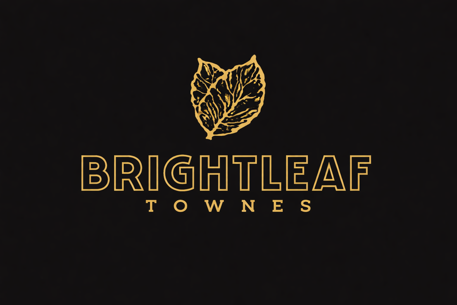
Draft 1.1: The Refined Primary Lockup
ICONOGRAPHIC ANCHORS
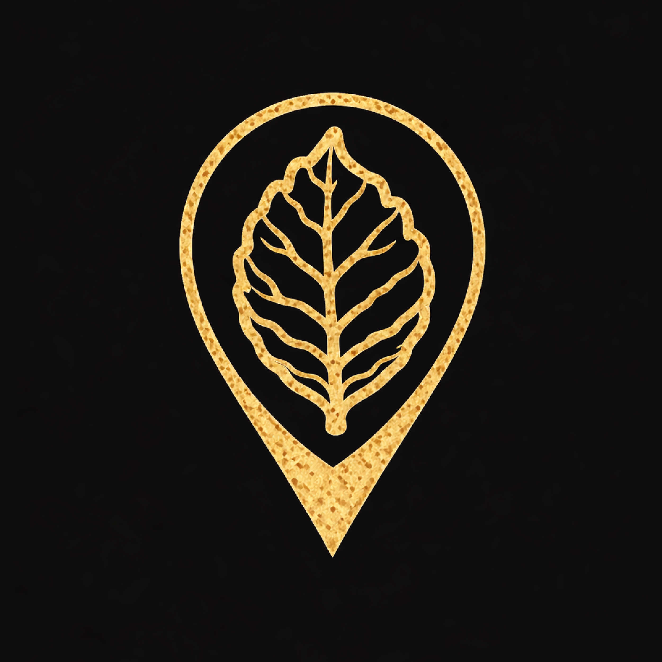
THE WAYFINDER
A custom map pin designed to bridge architectural geometry with the tobacco leaf vein structure. Built for site maps and physical street markers.

THE HERITAGE SUN
The signature brand mark. Representing the sun over tobacco fields, this icon serves as the "hand-stamped" seal of quality across all touchpoints.
01. ICONOGRAPHY SYSTEM
THE WORKHORSE
- Architectural: Rowhouse façades, stoops, and streetlamps.
- Lifestyle: Pet-friendly and walkability icons that feel engraved.
- Wayfinding: Custom map pins and leaf-vein arrows.
02. PATTERN SYSTEM
WHERE THE BRAND BREATHES
- Primary Leaf: Hero texture for backgrounds and packaging.
- Micro-Pattern: Subtle vein-line outlines for web and vestibules.
- Cigar Borders: Repeating frames inspired by tobacco geometry.
03. BADGES & SIGNAGE
HIGHLY WEARABLE
- Stamps: "Est. 2026" and "Greenville, NC" seals for merch.
- Environmental: Metal crests on stone and interior wallpaper.
- Digital: Understated, editorial web design with high contrast.
DIRECTION 02
THE HERITAGE SEAL
Drawing from the iconic "Cigar Box" aesthetic and the deep-rooted tobacco lore of Greenville. This direction explores intricate, archival emblems that suggest a legacy of craftsmanship, offering expansive opportunities for specialized tactile branding and custom lifestyle merchandise.
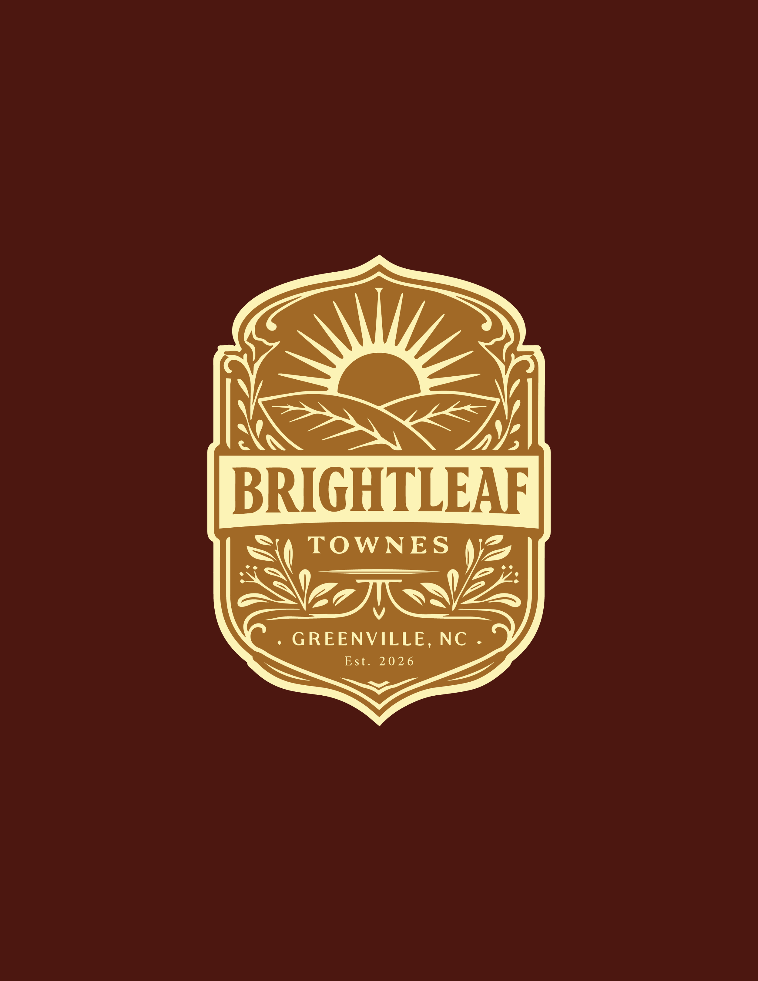
Draft 2.1: The Archival Emblem

Draft 2.2: The Vintage Press Variation
DIRECTION 03
REFINED TYPOGRAPHIC
Prioritizing unique letterforms and elegant flourishes to communicate luxury. This direction explores how custom typography can anchor the brand, blending modern serifs with sophisticated script accents to create a distinctive identity.
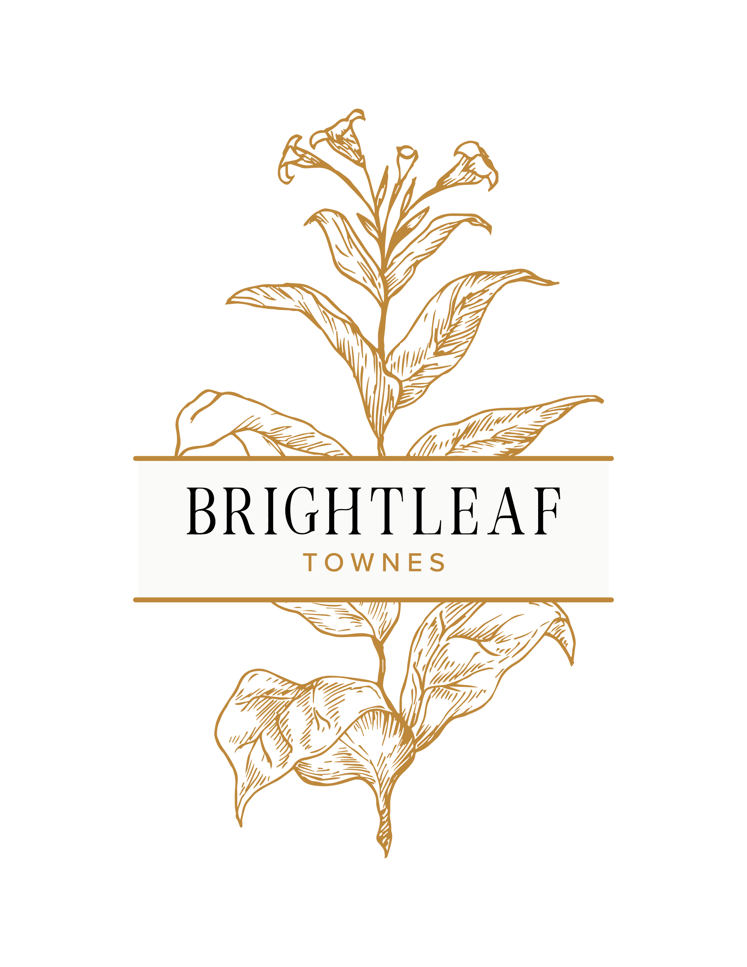
Draft 3.1: The Hand-Sketched Botanical
EXPLORATION
THE DRAWING BOARD
These concepts represent our active work-in-progress drafts at varying stages of development. By presenting these in their current state, we aim to identify which visual anchors resonate most before moving into formal refinement.
Concept 4.1: Iconic Sunburst Badge
Concept 4.2: Contemporary Serif & Crown
Concept 4.3: Geometric Icon Variation

