


History you
get to live in.
Brightleaf Townes brings Greenville's storied bright leaf tobacco district back to life. The original brick, steel, and timber now hold homes, shops, and workspaces, a rare place where a century of history is something you get to live inside. This guide keeps all of it looking and sounding like one place.
The marks.
Three marks, each with a job. Use the right one for the surface.
Primary Lockup
The default. Use it whenever space allows: marketing, headers, social banners, the top of every page.
Mark, Wordmark & Gold Variant
Use the mark alone at small sizes: avatars, favicons, monogram details. Use the wordmark when the mark is already implied by context. The gold wordmark is for hero moments: site heroes, profile art, dark feature panels.
On Black
Black-background versions for solid black panels, photos, and dark UI, where a transparent logo would not hold against a busy or near-black surface.
Spacing & Sizing
Keep clear space on all sides equal to the height of the "B" in the wordmark. A hard rule wherever the logo shares space with other elements.
Primary lockup: 120px wide minimum. Mark only: 24px, which also covers favicons and avatars. Below that, legibility breaks down.
Misuse
A few hard nos. The logo is the front door of this brand. Keep it clean.
Brick, brass, and
bright afternoon light.
The palette comes straight from the buildings: red brick, brass, cured tobacco, aged paper. Ink is the foundation. Gold is the signature. Everything else supports.
Gold
Cream
Rust
Tobacco
Ink and Paper Cream are the base layers. Gold is for emphasis: headlines, icons, buttons, links. Rust and Tobacco support, they never lead.
Cream text on Ink, Ink text on Cream. Gold on Ink holds at any size. Never set Gold text on Cream, it fails. Never set Cream or Gold over a photo without a dark overlay.
Accessibility
Approximate on-screen contrast. The first four pass for text. The last two do not, and you can see why.
Rust and Tobacco are background colors only. Set any text over a photo on a darkened overlay.
Two families.
Four voices.
Zesty Spirit carries personality and headlines. Wayside Colorado handles structure and labels. Together they cover a hero headline down to a caption.
brick walls.
Hierarchy in Practice
The frieze and
the leaf.
Three elements carry the brand beyond the logo. The gold band wraps headers, banners, and edges. The leaf mark anchors the identity and repeats as a quiet motif. The delivery car is the playful hero.

Top: the artwork. Below: the same band edge to edge. Run it gold on Ink along headers, section breaks, and social banners. Hold it to edges, keep type off the busiest runs, never stretch or recolor it. A vector master should follow for large use.
The heart of the identity. Use it solid, or screened back as a watermark. Keep it gold. Never outline it or fill it with a photo.
Texture, not a backdrop for text. Use it on headers, footers, and breaks, and keep content panels clean. As a watermark, hold opacity under fifteen percent.
The Delivery Car
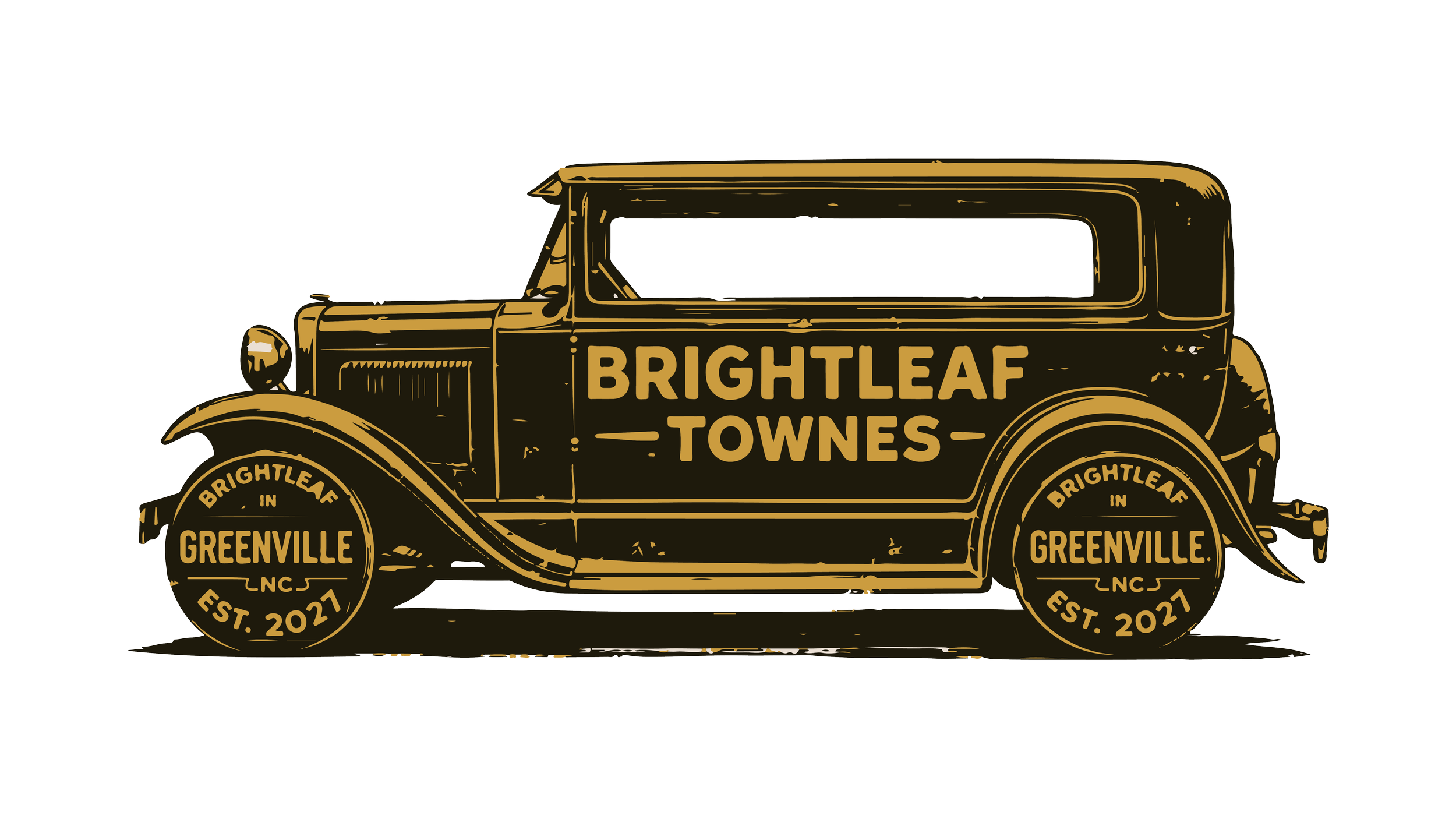
The vintage delivery car is the brand at its most playful. Use it as a hero illustration on the site, social, and feature moments, never as a logo. One per layout, kept whole, never recolored or stretched.
Built on bright leaves
and brick walls.
Where Greenville's bright leaf tobacco district once stood, a new neighborhood rises with its bones intact.
The Ficklen Factory and Star Warehouse have anchored Pitt Street since the 1890s, storing and shipping the bright leaf tobacco that built Greenville. Brightleaf Townes is what comes next: a mixed-use community shaped inside their original brick, steel, and timber.
The name pulls both ways. Brightleaf for the crop that put Greenville on the map. Townes for the old spelling that signals craft and permanence.
The brand should feel like the buildings: warm brick, brass, timber, golden light. Heritage you can touch, made livable.
The pitch is
the place.
One statement, written once and reused everywhere, so every channel tells the same story in the same voice.
Brightleaf Townes is a mixed-use community built inside Greenville's original bright leaf tobacco district. Where the Ficklen Factory and Star Warehouse once cured and shipped the crop that built this city, homes, shops, and workspaces now share the same brick, steel, and timber. Estd. 1896. Open again in 2026.
Tagline System
Primary tagline leads hero placements. Short form fits avatars and tight social. The endorsement travels with the logo lockup.
Campaign Tagline Lockup
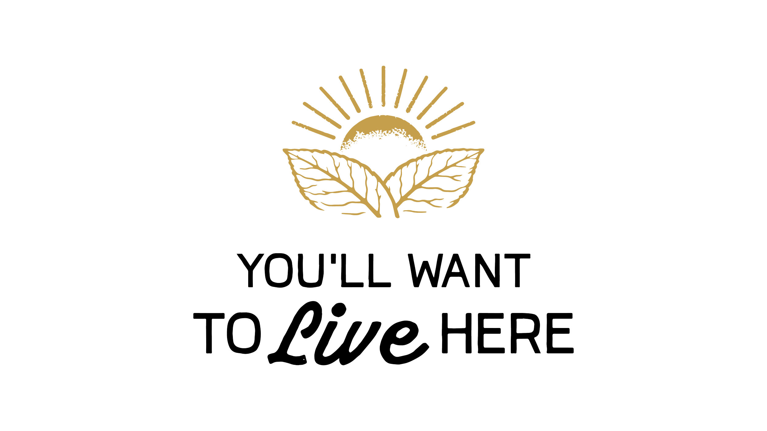
"You'll Want To Live Here" is the campaign line, locked up with the sun icon. Reach for it where the brand needs warmth and pull: hero sections, social, and ads. Keep the sun and type together, never split or recolor them.
On Pitt Street,
where it started.
Brightleaf Townes sits in Greenville's historic tobacco district, six blocks on the National Register. The buildings are the draw. The location keeps you close to everything around them.
historic. walkable. home.
Greenville planted its first tobacco crop in 1886. Within ten years the district lined Ninth Street, the Ficklen factory and Star warehouse among them. A century later the brick still stands, and the district is protected.
Now it comes back as a place to live, work, and gather. Walk out to coffee, shops, the green, and the rest of downtown. The history carries the address. The neighborhood does the rest.
The Timeline
First tobacco crop planted in Pitt County.
The Ficklen factory is built on Pitt Street.
The district joins the National Register of Historic Places.
Brightleaf Townes opens its doors again.
The Program
Confident. Warm.
A little weathered.
The voice is someone who has been here a while, happy to show you around. Direct, not clipped. Warm, not precious. Specific over abstract.
Reference the actual place. The brick. The trusses. Pitt Street. The 1896 stone above the door. Specificity is the brand.
The buildings have been here a long time. The voice should sound like it. No urgency tactics, no breathless adjectives, no exclamation points.
Speak to the reader as a future neighbor, not a buyer. The pitch is the place itself. Let the details do the selling.
- "A neighborhood built inside a tobacco warehouse."
- "Brick walls, timber beams, ground-floor retail."
- "Walk to coffee. Walk to the river. Walk home."
- "Estd. 1896. Open again soon."
- "Luxury living redefined."
- "An unparalleled lifestyle opportunity."
- "Exclusive amenities for the discerning few."
- Anything with the word "elevated."
Lines ready
to run.
A working bank, sorted by where lines live. All on voice: grounded, unhurried, specific. Pull from here so the language stays consistent everywhere.
- A neighborhood built inside a tobacco warehouse.
- Bright leaves. Brick walls. A place to call yours.
- Where Greenville's bright leaf district lives on.
- Estd. 1896. Open again soon.
- Lofts framed by original timber and steel.
- Brick you can touch. Light you can live in.
- Floor plans shaped around the old trusses.
- High ceilings, tall windows, a hundred years of patina.
- Walk to coffee. Walk to the river. Walk home.
- Ground-floor shops, upstairs living, all on Pitt Street.
- Small block. Long history. New front door.
- Greenville's history, made livable again.
- Built on bright leaves and brick walls.
- The warehouse stays. The story keeps going.
- One hundred and thirty years on the same corner.
- From the bright leaf boom to your front step.
Where the
brand lives.
Imagery does most of the heavy lifting. Shot or sourced, every photo should feel like the place: warm, real, unhurried. The brief is below.
Photography Brief
- Warm available light, golden hour over the buildings.
- Brick texture in close-up. Brass and steel hardware.
- Exposed timber beams and tall mill windows.
- The Pitt Street streetscape and the green.
- People who read as residents, not models.
- Editorial framing with room to breathe.
- Cold blue-white interiors and flat overhead light.
- Fisheye unit tours and wide-angle distortion.
- Staged stock smiles and posed groups.
- Anything that hides the building's age.
- Glossy real-estate render energy.
Across Channels
Ink backgrounds for heroes. Generous whitespace, editorial pacing. Motion slow and deliberate. Loading should feel like opening a heavy door.
Leaf mark as the avatar. Pattern as the profile banner. One headline from the bank per post. Captions in plain warm voice, never hashtag soup.
Wordmark at top, cream on Ink. One image, one headline, one link. Let the buildings carry the message.
Ease, never bounce. Fades and slow reveals over flashy transitions. Stagger hero elements on load. Nothing should feel rushed.
Buttons, links,
and fields.
The pieces on every page. Build them from the same tokens so the whole site feels like one hand made it. Examples below are live.
Buttons
Gold fill, Ink label, mono caps. The top action on a page. Darken gold slightly on hover. About 8 to 1 contrast.
Gold outline, Cream label, transparent fill. For secondary actions. On hover, fill gold and switch the label to Ink.
Links & Fields
Inline links use Brightleaf Gold on Ink. Underline on hover, not by default. Keep link text descriptive, never "click here."
Ink field, Cream text, hairline border. On focus, the border turns Gold. Labels sit above the field in mono caps.
Focus & States
Every interactive element needs a visible focus state. Use a two-pixel Gold outline with a small offset. Hover stays subtle, never a size jump. Disabled elements drop to forty percent opacity.
Right file,
right place.
How to pick a file, and how the package is organized. The folders below are the delivery order, so every build starts from the same map.
Asset Library
One link, always current. Every logo, font, icon, pattern, and image lives here.
Open the Asset Library