

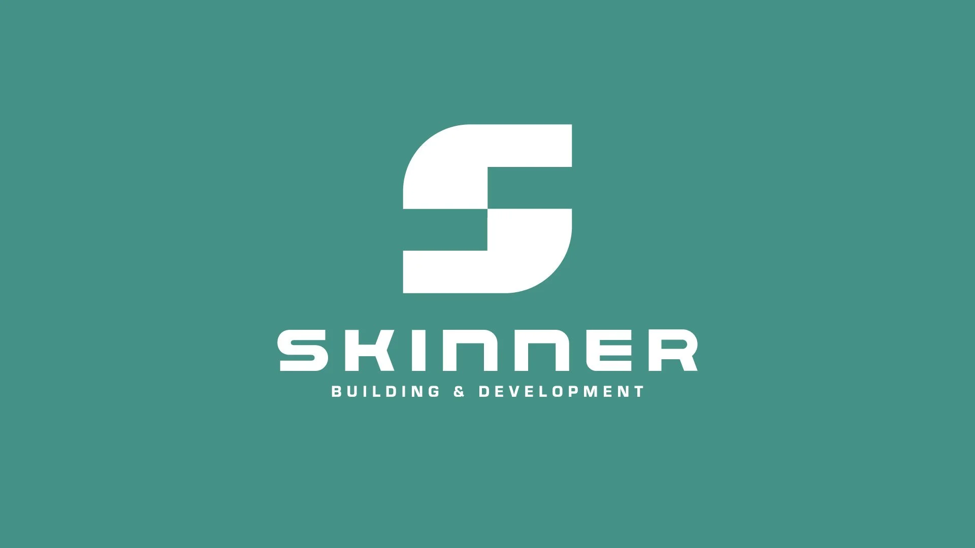
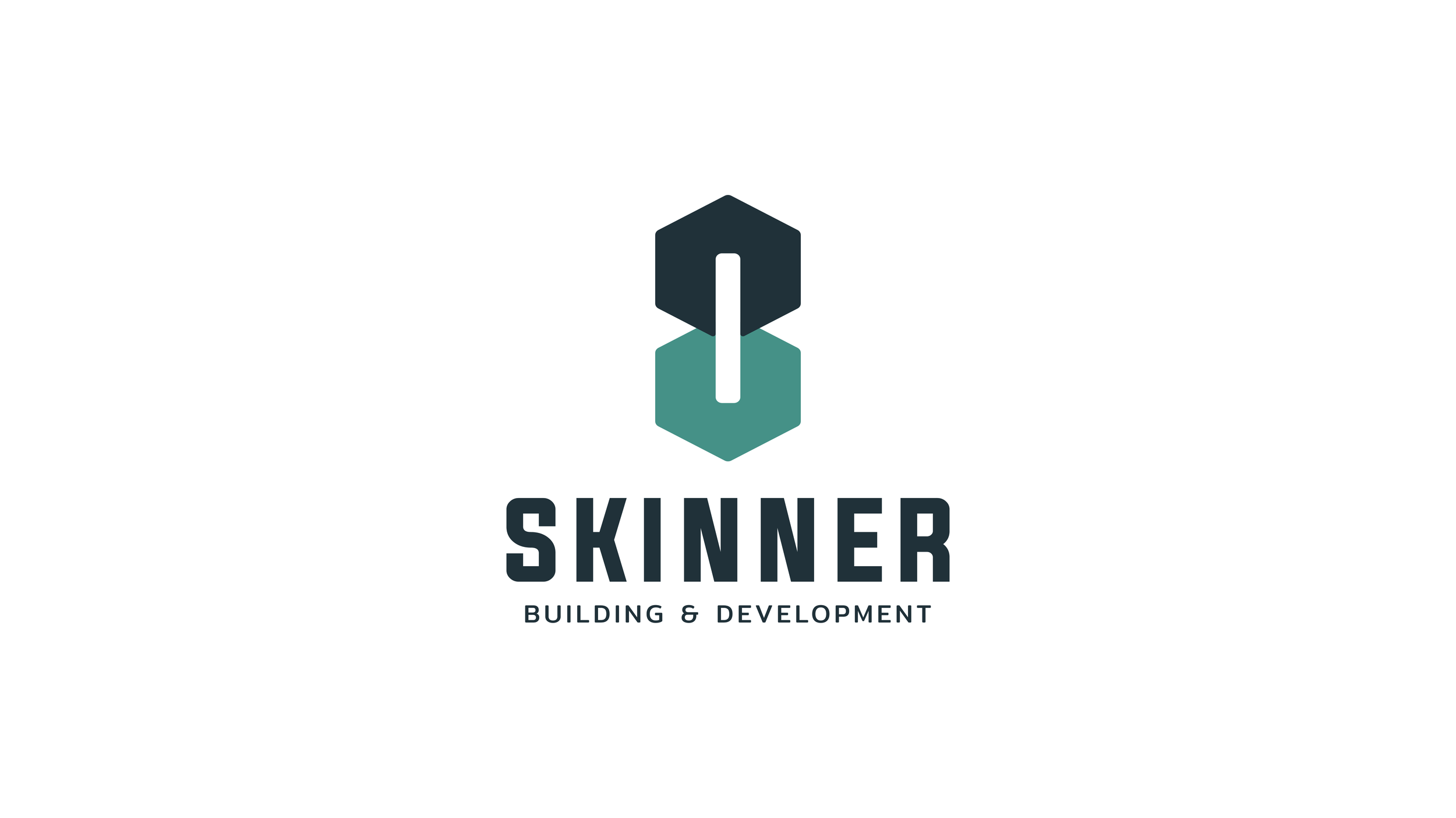
A. SKINNER
Building & Development · Logo exploration · Four directions, one foundation
What we heard
INTEGRITY,
BUILT INTO
THE MARK.
The three things that shaped every direction
- A new company carrying a name with decades of quiet weight behind it
- A brand that signals integrity before anyone says a word
- Nehemiah rebuilding the wall. Faith, craft, and resolve in one story.
The foundation is the client.
Andrew Skinner came to us with a clear picture. A. Skinner Building & Development is a new company, but it carries decades of real estate construction and development experience under the surface. The mark has to sit like that. Confident. Grounded. Built on something older than the business itself.
The reference point he gave us was Nehemiah. The wall. The work done with one hand while the other held the line. Faith and craft moving at the same speed. Every direction you see below is an answer to that brief, explored through a different lens.
Before we walk through the four directions
THE NAME.
THE COLOR.
Two small decisions that shape how every direction below reads. Neither is locked. Both are worth a short conversation up front.
Consideration 01 · Naming
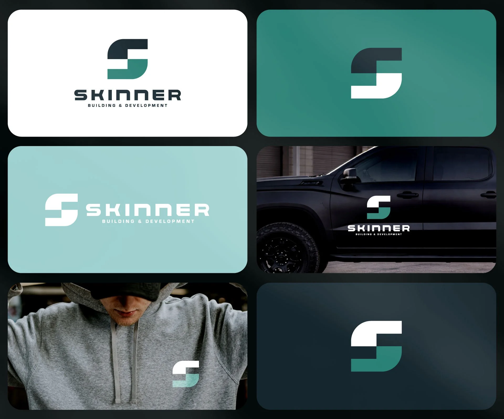
A. SKINNER, OR SKINNER?
A. Skinner is the name on the door. Skinner is the name on the truck.
Across every direction we explored, the mark sets stronger when the name is just Skinner. It holds more weight in type, it reads cleaner at a glance, and it carries the kind of one-word gravity that legacy construction brands earn over decades.
If the legal side or a personal reason points back to A. Skinner, we adjust with no friction. If there is room to move, our recommendation is to build the brand on Skinner and let A. Skinner live in the formal signature.
Consideration 02 · Color
TEAL IS THE START. NOT THE END.
Teal carries quiet authority. It reads professional and modern, and it sits apart from the sea of red, blue, and black that fills the construction category. For a builder who leads with integrity, that separation is useful.
Color is personal, though. It is the easiest thing in the world to swap. If Andrew has a stronger instinct or wants to explore a second palette, we turn it around in hours. The mark is what we are really deciding on below. Color follows the mark.
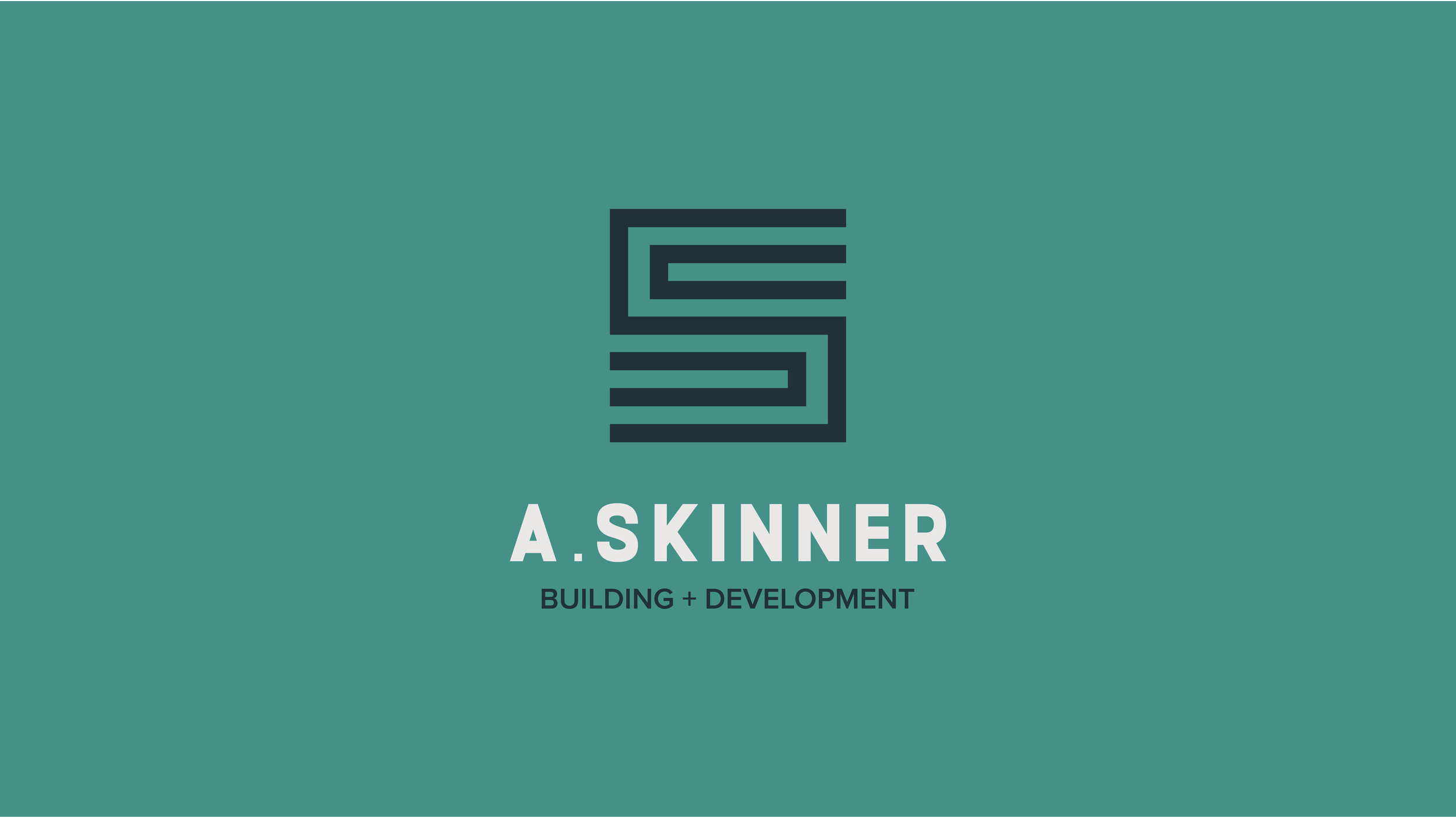
01
The deep diveTHE CORNERSTONE
Two stones. One letter. Every layer of the story.
This is the direction we spent the most time with, because it is the one with the most to say. Two bricks meeting to form the shape of an S. The same two bricks read as quotation marks. Every layer of the brief lives inside one mark.
The wall
Two stones, set. The Nehemiah parallel pulled directly into the mark. Masonry, craft, and the physical act of building, right there at the center of the identity.
The quote
Read the same shapes a second time and they are quotation marks. Scripture. The Word. The principles a man stands on before he ever picks up a tool.
The proposal
In construction, a quote is a promise. It is the number a builder puts his name on. The mark holds that double meaning too. Every project starts with a quote.
The letter
And finally, an S. Skinner. Owned, claimed, and readable at a glance on a truck door at fifty feet. Concept does not work unless the mark works first. This one does both.
02
The wall, standingTHE WALL
Strong. True. Fits perfectly.
A more literal read on the same brief. This direction takes the A and the S and builds them the way a mason builds a wall. Block by block. Line by line. The letterforms themselves become the structure.
The letters are the bricks
Where Design 01 abstracts the wall into a single S, this direction puts the wall on the page in full. A. Skinner, set in stone. No metaphor to decode. The brief is the image.
Heavy, in a good way
The blockiness does real work here. It reads like a stamp, a foundation, a structure you can lean on. Exactly the weight a construction brand wants on a sign, a truck, a drawing set.
Signage and scale
This direction gets stronger the bigger it gets. On a job site banner, on the side of a trailer, carved into stone, it reads with full authority. It is built for large format.
The traditionalist's pick
If the instinct is to keep things direct, immediate, and unmistakably about construction, this is the direction that answers that instinct the fastest.
03
The unexpected oneUNDER ONE ROOF
A house. A tool. A mark that sticks.
Two house silhouettes, mirrored, meeting in the middle to form an S. The rooflines double as the heads of a wrench. This is the direction that surprised us the most in review. There is more working here than the first look suggests.
The house is the product
For a company building homes and developing real estate, the most direct symbol on earth is the one it produces. Two houses, mirrored, becomes a promise. One built right. Then another.
The wrench is the craft
Look at the rooflines twice and they read as wrench heads. The hand, the tool, the work itself. Nehemiah with a trowel in one hand and a sword in the other. Same energy.
Symmetry is the promise
The mirrored build is not a styling choice. It is a message. What you see is what you get. Both sides match. Integrity is the shape of the thing.
Memorability is a brand asset
The S shape in this mark has a quiet superpower. It is the S every kid has drawn on a notebook margin. That instant, universal readability is something most brands spend years trying to earn. This one is born with it.
04
The architect's pickTHE FRAME
Lines that lock.
An A and an S, interlocked through a single continuous geometry. Where the first three directions reach for narrative, this one reaches for craft. Nothing is extra. Every line has a place.
The mark is a structure
This logo is built the way a house is built. Lines meet at intended angles. Negative space is load-bearing. The composition itself is the message, and the message is precision.
Blueprint energy
There is a quiet architectural confidence here. This is the mark that looks at home stamped on the corner of a drawing set, engraved on a plaque, or set small and clean on a business card.
For the design-led client
If A. Skinner wants to build for buyers who care about craft, detail, and restraint, this mark speaks their language before the first conversation starts. It signals taste.
It will age well
Geometric, type-driven marks like this one do not chase trends, because they were never following one. Ten years from now this direction reads exactly the same way it reads today.
Pick a direction, or two
LET'S
BUILD
IT RIGHT
Four directions, one foundation. Tell us which mark feels most like the company you are building, and we take it from there. If two are close, we can push both another round before we pick.
01
Pick a direction
Review with Andrew and share initial reactions, gut calls, or a shortlist
02
Refine the mark
Lock typography, color, and the spacing rules for every size and surface
03
Full brand kit
Files for truck, apparel, signage, business cards, and the web presence